1 - Can you give us a brief introduction to SIA and your team?
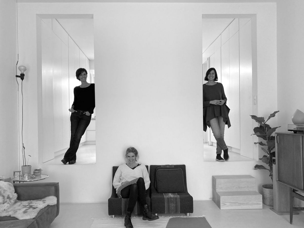
SIA Arquitectura was founded by Sofia Pinto Basto, Inês Cordovil and Ana Cravinho in 2007. The practice works alongside a group of external collaborators and associates that consolidates and builds itself according to the Project needs. SIA's work started with the remodeling of small-scale buildings, with an approach to interpret both their historical modifications and practical adaptations. Over time the projects grew in scale. Our research on remodeling continues to be the basis of our practice, even in new projects, insofar as it shapes our gaze towards the specificity of each place and program (as opposed to a repetition or a "standardisation” of models). Our aim is to transform the existing, by understanding, adapting or replacing. The practice of architecture entails choices and the conviction that small, rigorous and relevant actions are naturally amplified. To listen is the main exercise of our profession.
2 - What was your inspiration behind the design of the Atelier project?
This project aims to introduce the scale and atmosphere of an industrial building into a housing typology, responding to Marvila's hybrid and creative identity. It materialises, for example, in the abstraction of the façade and the open-plan typologies with reduced peripheral circulations.
3 - What design elements did you prioritise to ensure each home is both functional and visually appealing?
We prioritised generous living areas and open spaces connecting interior to exterior atmospheres. Natural light and its distribution was also top of mind during the design process. We wanted to explore how it could be spread throughout the house, and play with the “shape” of its shadow.

4 - Did you incorporate the history and character of the former atelier into the design of the townhouses?
Yes, we think the memory of the former atelier is a presence. Although, it comes subtly and metaphorically given the difference in programs.
5 - Can you walk us through the layout and floor plan of the homes?
The building has 8 apartments with different typologies, T1 to T4. The layouts tend to be flexible in terms of occupancy with a spatial fluidity that meets a more contemporary living style. Each home is organised around a large central open plan referring to the memory of the “Lofts” associated with the occupation of industrial fabrics in cities, amplifying the sense of scale.
The apartment layouts were designed around the living area, which is also the entrance and distribution space for the bedrooms. This large space contains the living room, dining room and kitchen, with dual side lighting and ventilation from East and West, extending to the balconies and outdoor gardens.
The houses on the ground floor have a privileged relationship with the gardens to the West, generous ceiling heights and courtyards as a buffer to the street, with filtered light through the facade. On the intermediate floors (1st to 3rd) the apartments have an identical spatial and programmatic organisation, allowing a typological variation from T2 to T4, depending on whether one of the rooms is allocated to the fraction on the right or left side. The houses on the 1st floor are distinguished by their relationship with the gardens and on the 3rd floor by the sloped ceiling heights taking advantage of the roof configuration.


6 - What materials have you selected for the refurbishment process and why?
We aimed to build a new building with the character of an occupied industrial building. We believe that the feeling of comfort is directly associated with the memory of spaces with clear identities that are part of our collective history.
Small-scale industrial buildings made use of current, simple materials that aged well. Our material choices include naturally burnt and waxed wooden floors, lime plasters, and terrazzo in the bathrooms.
Another reinterpreted element is the glazing on the facades, large scale windows with a constant rhythm, protected with a delicate layer of screens and curtains.


The main challenge was probably the material of the main façade. We had an idea from the beginning to use a screen as a veil of intimacy for the interior (as a Japanese screen) and at the same time as a performative element in the façade's expression towards the street.
The material of the façade had a series of design premises, to become a poetic element, such as the depth of the shadows, and more technical issues such as the integration of its structure or the thermal behaviour.
We decided to use a system of pre-tensioned screens, which is less common in residential buildings, to build this ambition of an abstract façade that veils and reveals.

The project had already incorporated various aspects that became reinforced during the pandemic, such as generous living areas, different ambiances, natural light, and open spaces connecting the interior and the exterior.
Maybe the importance of the green areas in the quality of our everyday life (that became obvious in the pandemic situation) indirectly affected the decision to create 4 private gardens rather than 2.
8 - How did you maximise natural light and outdoor spaces in the design of the homes?
The dual aspect design of the living rooms, connecting the east and west façades, promotes the crossing of natural light through the space during the day. This gives different atmospheres to the space due to the change of colours and shadows. It extends the interior space to the exterior towards the street and the gardens.
The gardens were designed with the Landscape Architects team BALDIOS. We felt the gardens should be grounded to earth in its organic design and materiality emphasising the lightness of the building.


9 - What is it about the neighbourhood of Marvila that you think draws artists and creators to make their base there?
Going back to the idea that we feel attracted to urban spaces with recognisable identities that are part of our “genetic memory”, Marvila is one of these urban areas. Marvila has its own identity as a harbour city, with the river’s vibration and the different scale buildings alternating between industrial warehouses, small residential buildings, and townhouses.
One can also find a new centrality in places that were once peripheral, due to the search for areas with more affordable prices as traditional historic centres become more and more expensive. Creative industries are often pioneers driving this type of phenomenon, considering their need for bigger spaces at reasonable prices and their ability to think “outside the box”. This is what we can see happening in this area of Marvila-Rio.

